Output from the national emission mapping model "MapEIre" is presented in the maps below. Emissions included in the model correspond to the emissions in the national emission inventory as reported to international conventions and directives in 2017. MapEIre provide emissions with a high spatial resolution of 1 km x 1 km.
Spatial mapping is run by sector in the model to ensure the most accurate allocation of the emissions. This approach permits output of spatial emissions from a single sector, from a group of sectors, or as the sum of all sectors (the national total emissions).
The maps in Figure 1a-d illustrates the opportunity to generate spatial emission on different sectoral aggregation levels; for a single sector (Figure 1a and 1b; railway and LTO), for a group of sectors (Figure 1c; road transport) and as a sum of all sectors (Figure 1d; national total).
The pattern on the emission maps for rail transport, road transport, and LTO (aviation, landing and take-off) reflect the location of the rail lines, the road network, and a 5 km buffer zone around the largest airports. The pattern on the map of national total emissions is a combination of the different patterns for all the sectors in the national emission inventory. National total NOx emissions are dominated by emissions from road transport, power plants, shipping and residential plants. Large point sources like power plants are difficult to see on the map, unless a high zoom level is used, as they influence only single grid cells. Residential plants and roads occur over most of the land area, and the densities are generally higher in areas with high population density. On the map this is seen as a base level of emissions for the major part of the area, and elevated levels especially in larger urban areas. Emissions from road transport mainly occur on the heavily trafficked roads, and following the national road network is visible on the map with elevated emissions as well.
Figure 1 a-d High resolution spatial emission maps for Ireland showing a) NOx emissions from railway transport, b) SOx emissions from domestic landing and take-off (LTO), c) NOx emissions from road transport, and d) national total NOx emissions. All maps show emissions for the year 2015, and correspond to the national emission inventory for Ireland.
a) 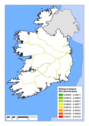 | b) 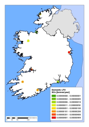 |
c)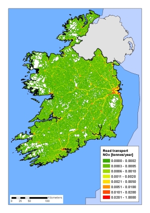 | d)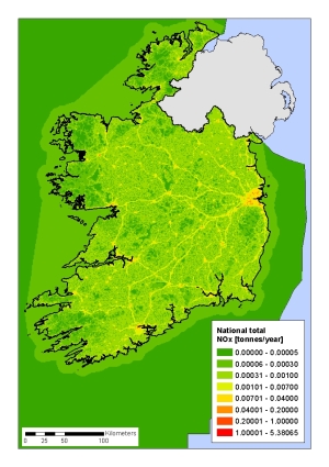 |
The maps in Figure 2a-e show national total emissions of NOx, SOx, NMVOC, NH3 and PM2.5 for the year 2015.
The largest sources to emissions of SOx are residential plants, power plants, and refining, and hence the map is dominated by point sources and urban areas.
The largest sources to emissions of NOx are road transport, power plants, shipping, and residential plants, and also this map is dominated by point sources and urban areas. Further, the major roads are visible on the map.
The largest sources to emissions of NMVOC are agriculture, food and drinks, domestic solvent use, residential plants, and road transport. The map shows a high level of base emissions due to agriculture and industry, which occur over the main part of the land area. Elevated levels in densely populated areas owe to emissions from solvent use and road transport.
Emissions of NH3 mainly come from the agricultural sector. The largest sources are cattle, manure applied to soils, grazing animals, and mineral fertiliser. The pattern on the map basically reflects animal density and the agricultural area. No NH3 emissions occur from water-based sources.
The largest sources to emissions of PM2.5 are residential plants, agriculture, and road transport, and following the large urban areas are clearly visible on the map, and to a less degree also the major roads.
Figure 2 Spatial emission maps for Ireland showing national total emissions for the year 2015 of a) SOx, b) NOx, c) NMVOC, d) NH3, and e) PM2.5
a)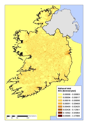 | b)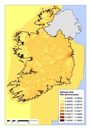 |
c)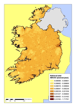 | d) |
e)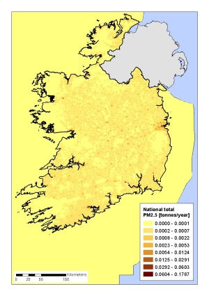 |
The maps in Figure 3a-e show national total emissions of NOx, SOx, NMVOC, NH3 and PM2.5 aggregated to the EMEP grid with a spatial resolution of 0.1 degree x 0.1 degree. The spatial emissions correspond to the national total emissions reported 1st May 2017 to the UNECE Convention on Long-Range Transboundary Air Pollution (LRTAP).
Due to the lower spatial resolution of the mapping (0.1 degree x 0.1 degree corresponds to around 7 km x 11 km for Ireland), the emission pattern is very general and does not show the same level of details as the high resolution maps presented above. E.g. emissions from road transport are aggregated to a spatial level where even the major roads are not visible in the maps.
Overall, the most noticeable pattern on the low resolution maps is high emission levels in large urban areas, where densities of transport, buildings and population are high, and following also the emission levels. The exception is the NH3 map which is by far dominated by emissions from agriculture, and shows the highest emission levels in rural areas.
Figure 3 Spatial emission maps for Ireland aggregated to the 0.1 degree x 0.1 degree EMEP grid showing national total emissions for the year 2015 of a) SOx, b) NOx, c) NMVOC, d) NH3, and e) PM2.5
a)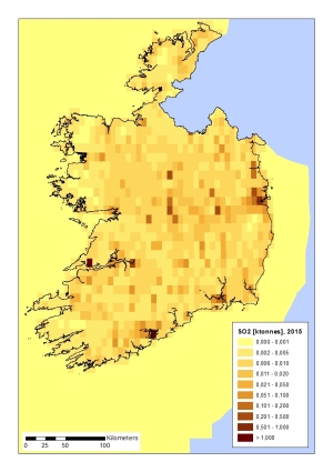 | b)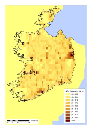 |
c)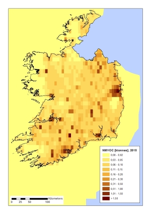 | d)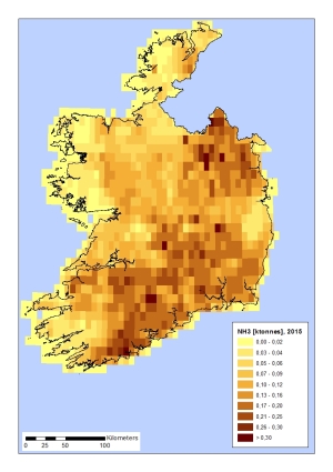 |
e)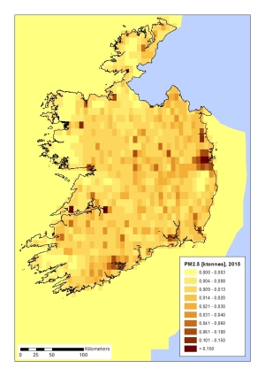 |
The maps in Figure 4a-d show national total emissions of CO2, CH4, N2O and HFCs for the year 2015.
The largest sources to emissions of CO2 are power plants, road transport and residential combustion, and hence the map is dominated by point sources, the road network and urban areas. Both CO2 emissions and removals are included in the national total. The major part of the removals occur in forest areas, which are also visible on the map.
The largest sources to emissions of CH4 are agriculture and solid waste disposal. Emissions from enteric fermentation for cattle, which is the dominant source, are allocated to the farms, and hence it is hard to identify on a national map, as is the case for power plants and other point sources.
The largest sources to emissions of N2O are fertiliser use on agricultural soils and grazing animals, and hence the map is dominated by agricultural areas.
Emissions of HFCs mainly occur from refrigeration and air conditioning, and the largest emission levels are seen in built up areas, especially urban areas with high population density.
Figure 4 Spatial emission maps for Ireland showing national total emissions for the year 2015 of a) CO2, b) CH4, c) N2O, and d) HFCs
a)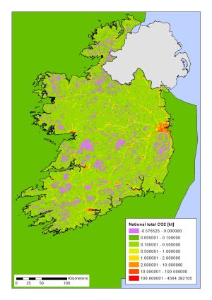 | b)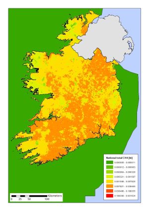 |
c)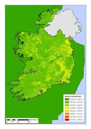 | d)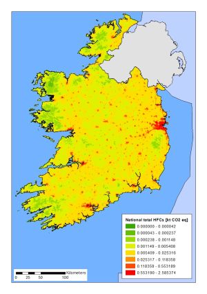 |
